Finding the Root Cause: Making Soil Health More Visible
OVERVIEW
How can we make it easier for farmers to find soil health guidance that translates into real improvements on their land?
Stakeholders initially asked for a redesign of the Soil Health page, believing a new layout or content would draw more attention to one of NRCS’s flagship topics. But early analysis revealed a deeper issue: people weren’t reaching the content easily. Our research showed that valuable soil health information was buried in the site’s structure, lacked clear navigation pathways, and didn’t reflect how users actually searched for soil health guidance.
By uncovering the real problem, we were able to propose evidence-based, incremental improvements that increased visibility, supported content expansion, and laid the groundwork for a future redesign.

-
Company
Project completed while employed at Aleut Federal for client USDA (NRCS website)
-
Role
Lead UX Architect & Researcher
-
Team
UX Design Manager, UX Designer, Visual Designer, Stakeholders from Product and content teams
THE CHALLENGE
The Soil Health topic sits at the heart of NRCS’s mission, yet users weren’t engaging with the topic as expected. Despite its importance, the page ranked 22nd in overall site traffic.
Stakeholders had been investing significant effort in developing richer, more comprehensive Soil Health content—resources designed to better serve farmers and ranchers and bring together information that had previously been scattered across the site. Once some of this new content was ready, they asked our team to design an updated page to showcase it.
The expectation was that improved content and layout changes would draw more attention to this flagship topic. But early analysis suggested the issue ran deeper. While the focus was initially on visual and content improvements, the real problem was one of findability and relevance. We wanted to ensure that, with so many resources going into curating this valuable content, users could actually find it once it went live.
“Visibility starts with findability. Before improving the design, we had to fix the path to it.”
DISCOVERY AND RESEARCH
As the research lead, I planned and conducted the discovery effort. Using data from Google Analytics, Hotjar, and Qualtrics, we examined how visitors were engaging with the Soil Health ecosystem—from the homepage to deeper content pages—and where they were dropping off.
To learn more about who was visiting the site and what they needed, we launched a user survey and analyzed responses alongside behavioral data. We also ran a card sort in Optimal Workshop to validate assumptions about navigation and uncover opportunities for a more intuitive structure.
As we dug deeper, we found two distinct audience groups emerging: newer visitors who didn’t know where to begin and seasoned soil health professionals seeking deeper educational materials and technical literature. This mix of needs meant the page had to serve as both an entry point for beginners and as well as more seasoned experts.
"Newcomers needed clear entry points. Experts needed depth. Balancing both became a guiding principle for the redesign"
The research revealed three key insights:
These findings reframed the problem from “We need a redesign” to “We need to make critical content easier to discover and understand.” The insights directly informed our quick-win priorities and the roadmap for long-term Information Architecture (IA) and content improvements.
#1 Findability, not design, was the core issue
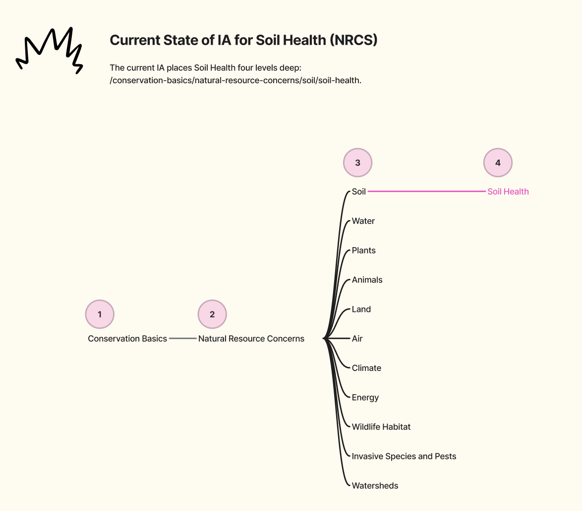
Users struggled to locate soil health content, often exiting before reaching the right pages. The Soil Health page ranked 22nd in pageviews, likely due to being buried four levels deep.
#2 Homepage entry points were underutilized
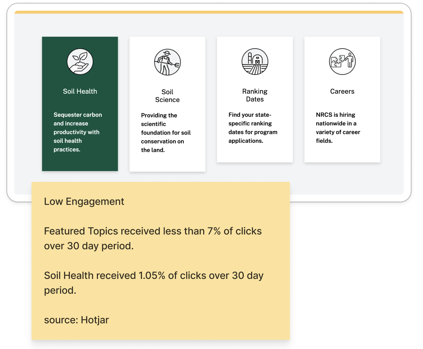
Fewer than 7% of clicks occurred among the homepage featured topic cards, suggesting users weren’t noticing or engaging with featured topics.
#3 Content needs to address multiple audiences
Both the Soil and Soil Health pages needed to guide beginners while offering greater depth for experts. The main Soil page attracted both educators and researchers (37%) and beginning farmers (20%), but that beginner segment dropped to just 11% on the Soil Health page. This gap suggested that newer visitors weren’t finding or recognizing the path to Soil Health content, even though it directly aligned with their interests.
Newer farmers just wanted to understand the basics—‘What is crop rotation?’ ‘Where can I find information for my land type?’
Meanwhile, educators and researchers were looking for more depth, calling the existing page ‘too vague’ and asking for links to studies and educational resources.
THE APPROACH
Once the key problems were identified, I translated our findings into prioritized recommendations that balanced user needs with stakeholder readiness. We focused on changes that could make a visible impact quickly while larger content and navigation updates continued through review.
As enthusiasm grew, scope expanded—new content ideas surfaced quickly, and review cycles lengthened. To maintain momentum, we prioritized quick wins that could be launched immediately, while the content team continued refining new materials in parallel.
Although a federal government shutdown paused implementation before full rollout, all research and strategy documentation was handed off to guide future updates, ensuring alignment when work resumed.
Top Recommendations:
-
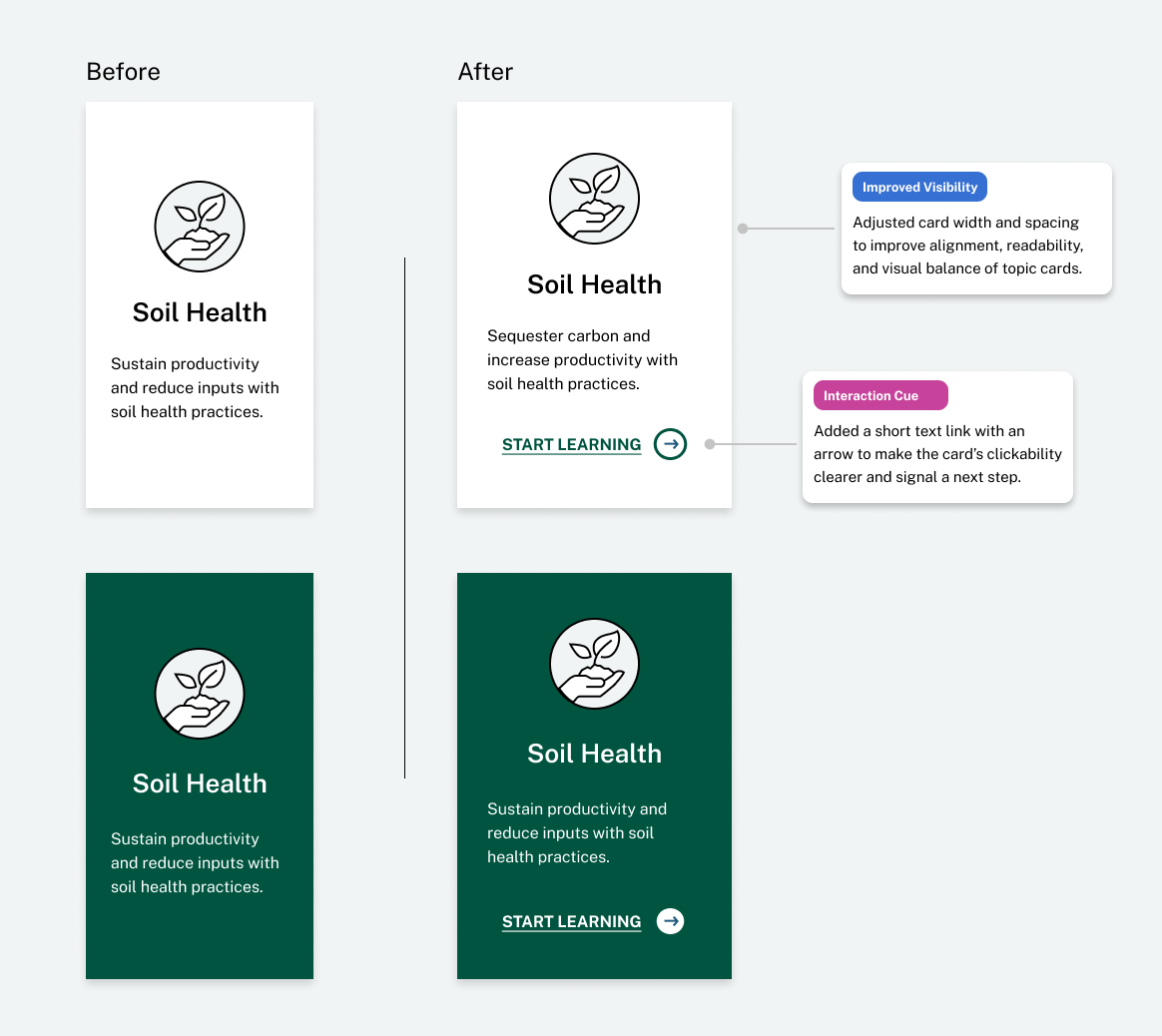
Improve homepage visibility: Make the Soil Health card more prominent and signal interactivity with a clear text link and arrow.
-
Simplify the site’s IA: Reduce depth to
/conservation-basics/soil/soil-healthfor consistency and easier navigation. -
Strengthen the Soil–Soil Health connection: Add a call-to-action and update intro content to guide users to the right place.
-
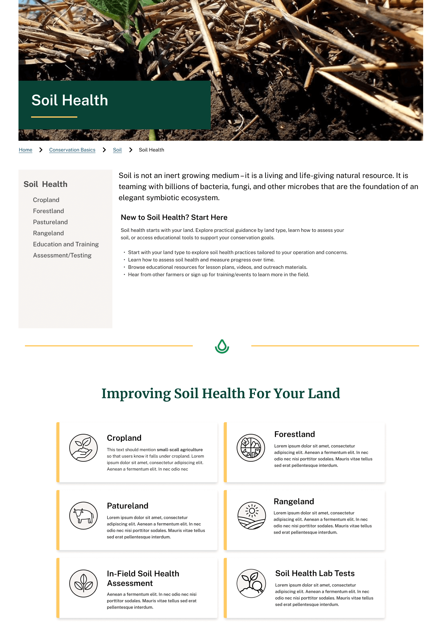
Reorganize Soil Health content: Add a “Getting Started” section to orient new visitors, update the page layout to surface land-type content through visible cards and sub-navigation, and refine hierarchy to balance both audiences—making it easy for beginners to find guidance while preserving the depth valued by educators and researchers.
THE OUTCOME
Our research reframed the problem and led to immediate, measurable improvements. By optimizing homepage entry points and refining the Soil Health CTA card design and placement, we made the topic significantly easier to discover.
The result: The Soil Health page rose from the 22nd to the 10th most-visited page within a month of launching the update on the home page.
Subtle change. Big shift.
These small, evidence-based changes built momentum for the larger NRCS redesign—demonstrating how even incremental UX work can drive meaningful impact within a complex federal system.
Beyond visibility metrics, this effort established a long-term foundation: the research validated user demand for land-type content and directly informed the next phase of NRCS’s site-wide redesign.
“This project reinforced that research doesn’t just validate solutions—it reframes the problem.”
It also proved that small, well-informed changes can have outsized impact when guided by insight, collaboration, and clear communication—a reminder that meaningful UX work often starts by uncovering what’s been there all along.
